Now, it’s easy to get all gung-ho about jazzing up your main website and product pages, but hold up! Landing pages, my friends, they’re where the real magic happens when it comes to turning visitors into red-hot leads.
So, how do you make sure your landing pages are firing on all cylinders? Let’s dive in and check out what needs to go into these bad boys to get you some serious conversions.
Understanding the Lay of the Land: What’s a Landing Page Anyway?
Alright, before we jump into the nitty-gritty, let’s set the stage. A landing page is like that smooth-talking buddy who convinces you to try a new restaurant. It’s a page on a website built to turn visitors into leads, hustling them towards filling out a form in exchange for something shiny—like a top-notch ebook, a killer offer, or a sweet discount.
See, the name of the game with a landing page is simple: tell visitors what you want ’em to do and why they should care. These aren’t your run-of-the-mill website pages. Nah, these pages are tailor-made for a specific purpose, aimed at getting folks to take a specific action.
Unveiling the Secrets: What Goes on a Landing Page?
1. Skip the Homepage Hype
Look, I get it. Your homepage is cozy, familiar, but landing pages? They’re your secret weapon for converting leads. So, resist the urge to shuffle visitors off to your main site or product page. They need a special dance floor, folks!
2. Building Blocks of a Standout Page
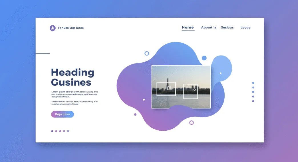
When you’re crafting your landing page, think essentials. You’ll need a headline that packs a punch, a tasty description of what’s up for grabs, and don’t forget an eye-catching image or snappy video. Oh, and sprinkle in some proof elements like testimonials or security badges for good measure.
3. Swipe Left on Extra Navigation
Keep it simple, folks. Strip that navigation bar away! Your goal? Keep those visitors glued to your landing page until they do the deed—signing up, downloading, or whatever action you want ’em to take.
4. Clear as Crystal Objective
Cut the fluff, people! Your landing page’s job is to be crystal clear about what’s on offer and what you want your visitors to do. Keep it short, sweet, and straight to the point.
5. Matchmaker, Matchmaker
Whether visitors come from a PPC ad or an email, keep the message consistent. What’s on your ad should match what’s on your landing page. A mismatch? That’s a one-way ticket to the “Back” button.
6. Say No to Friction
Friction’s the enemy here, folks. Don’t clutter the page. Keep the goodies upfront, save the nitty-gritty for later, and don’t distract your visitors with internal links.
7. The Value Proposition
Value, my friends, is what seals the deal. Make sure your offer on that landing page is worth a visitor’s time and info. Valuable stuff? Think free trials, juicy guides—stuff that screams, “Take me, I’m yours!”
8. Only the Essentials, Please
When it comes to those forms, keep it real. Only ask for what you absolutely need. Nobody needs to know their favorite ice cream flavor just to download an eBook, right?
9. Quantity Does Matter
More landing pages, more chances to snag those leads! Don’t hesitate to create a new landing page for every new campaign or offer. They’re like your secret stash—hidden from your main site’s clutter.
10. Sharing is Caring
Here’s the cherry on top: make those landing pages shareable! Toss in some social media sharing links, and watch as your content spreads like wildfire.
Alright, folks, here’s the lowdown: crafting killer landing pages isn’t rocket science, but it does take finesse. Stick to these tips, tweak, test, and voila! You’ll be turning your website into a lean, mean, lead-generating machine.


